Nexura
A centralized hub that connects apps to make life simpler and more organized
Overview
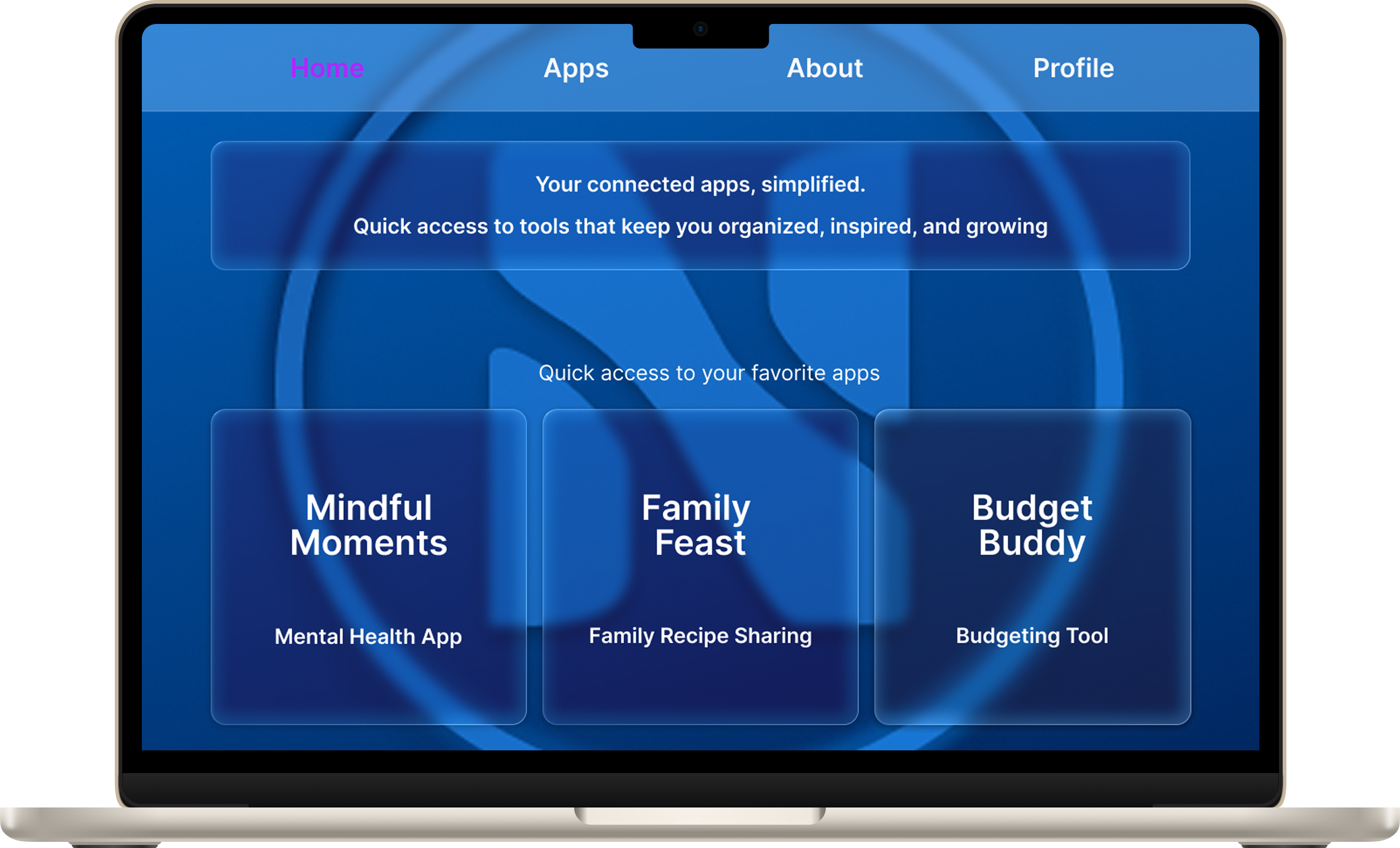
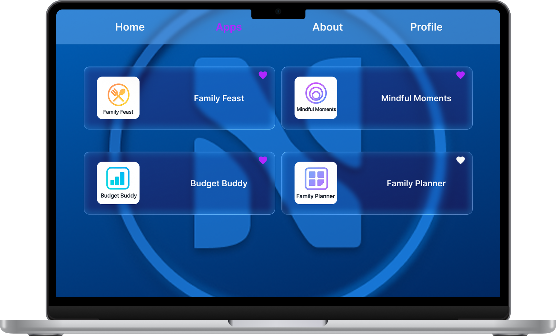
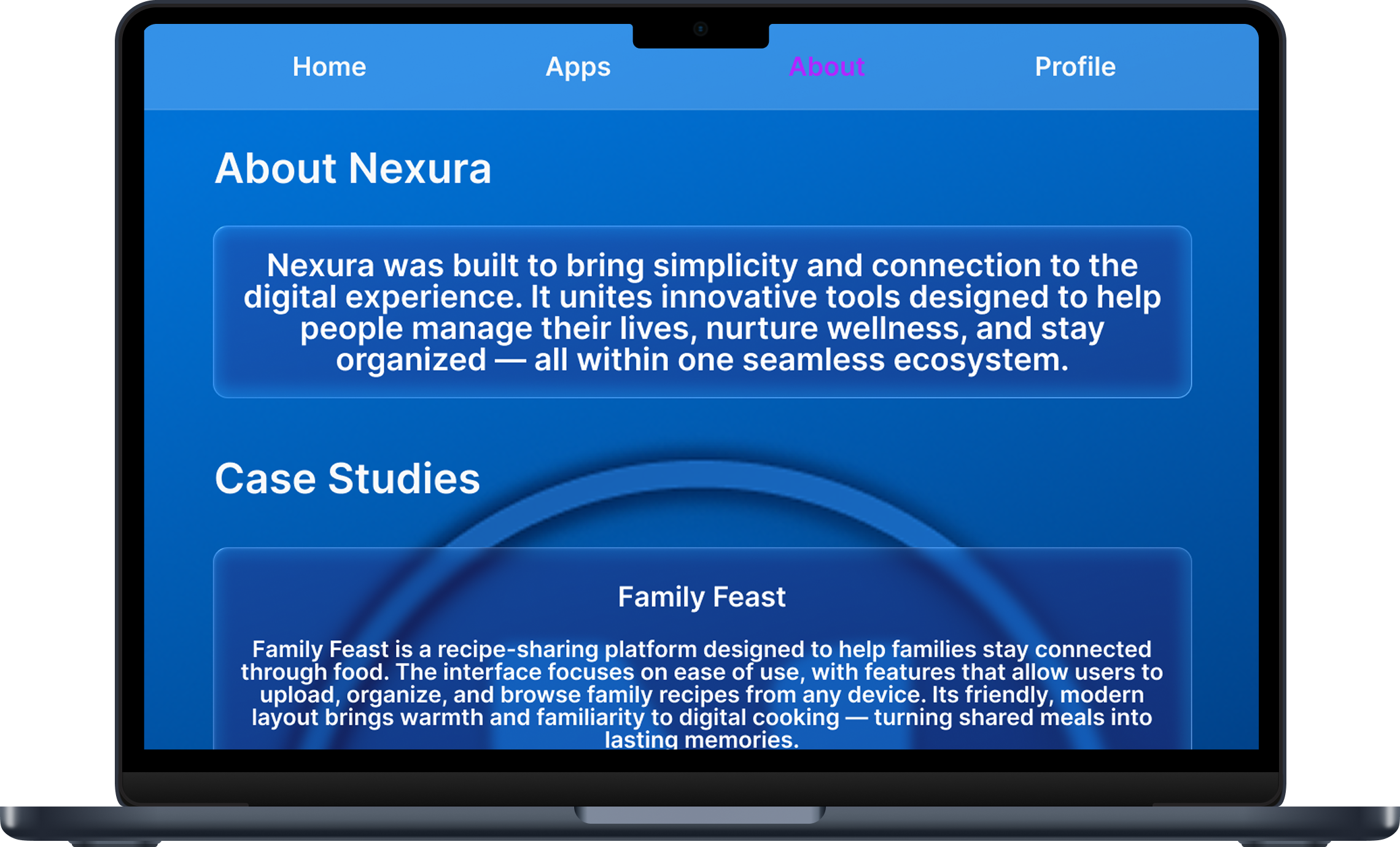
Nexura is a unified digital hub designed to seamlessly connect all of my UX projects into one cohesive ecosystem. Acting as a central access point, it allows users to explore and navigate between productivity-focused apps such as Budget Buddy, Mindful Moments, Family Planner, and Family Feast—each serving a unique purpose while maintaining a shared design language. Built with a liquid-glass aesthetic, Nexura embodies a balance between technology and calm usability. The goal was to create a hub experience that not only felt futuristic and fluid but also practical, offering users a single destination to engage with multiple apps in an intuitive way.
Problem
As I began building a collection of UX projects—each designed to improve different areas of daily life—I realized there was no central way to experience them together. Each app existed independently, making it difficult to visualize how they could function as part of a unified ecosystem. This fragmentation diluted the sense of cohesion and made it harder for users to understand how these tools complemented one another. I needed a way to bring them together under one identity while maintaining clarity, accessibility, and visual harmony.
Goals
The goal of Nexura was to create a central hub that connects all of my apps into one cohesive platform. I wanted the experience to feel fluid, futuristic, and simple—showcasing each app’s individuality while reinforcing their shared design system. The interface would act as both a gallery and a gateway, allowing users to explore apps, learn about their features, and navigate between them effortlessly. Beyond functionality, Nexura aimed to demonstrate how strong design systems can unify multiple products while enhancing discoverability and user experience.
User Persona: Jordan Ellis
Jordan is a 29-year-old creative professional who enjoys using digital tools to stay organized, centered, and inspired in both work and personal life.
- Access multiple productivity and wellness apps from one place without constantly switching platforms.
- Discover new tools that enhance balance, focus, and everyday organization.
- Maintain a visually appealing, intuitive experience that feels both efficient and enjoyable.
- Managing multiple logins and interfaces across different apps.
- Feeling overwhelmed by cluttered or inconsistent app designs.
- Having to spend time searching for the right tool for a specific need.
- A unified hub that connects multiple apps seamlessly.
- A clear, easy-to-navigate interface with strong visual consistency.
- Reliable access across devices for a continuous, flexible user experience.
- Goals:
- Frustrations:
- Need:
Design Process
Wireframes
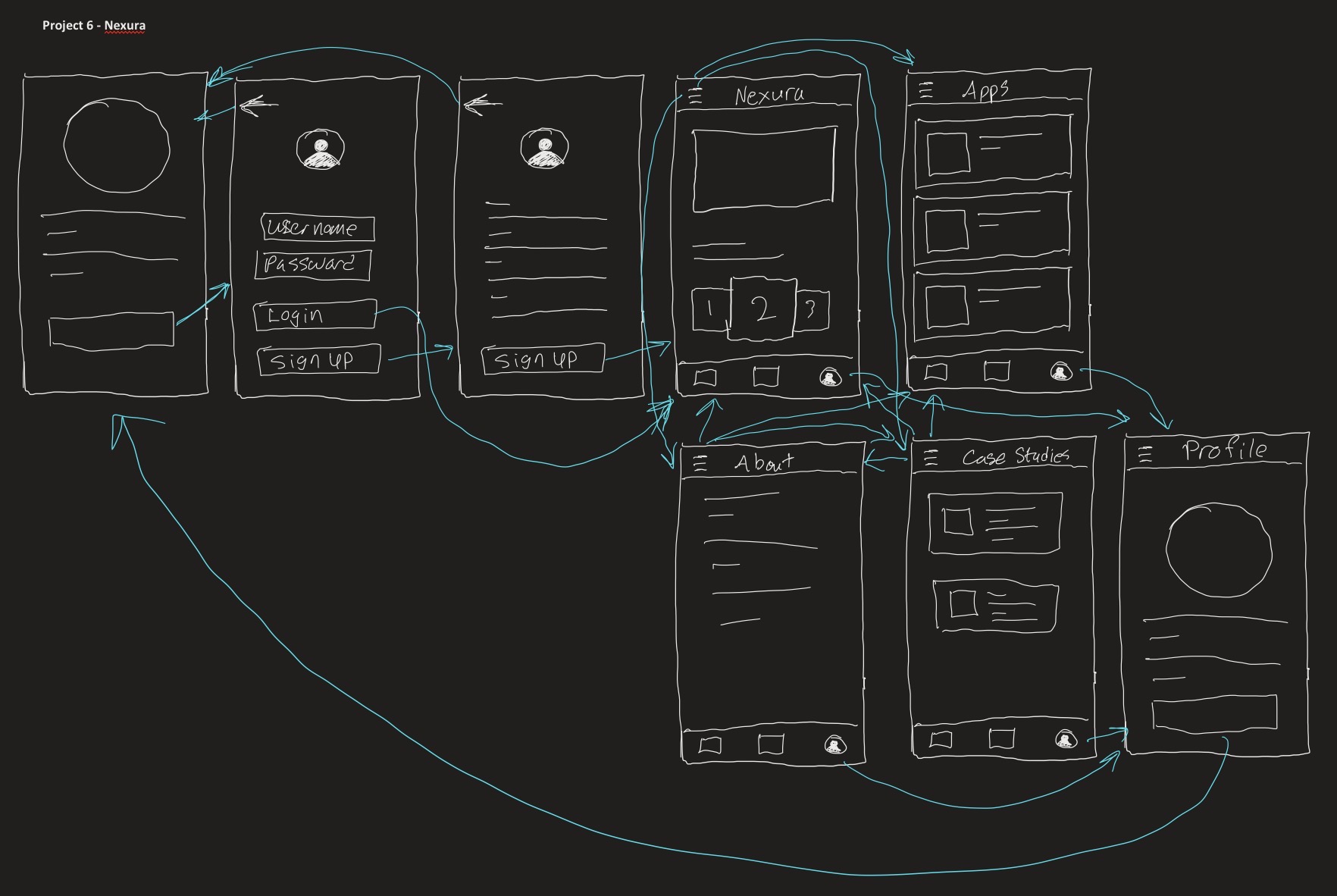
Rough sketches of what I envisioned the Nexura to look like
Low Fidelity
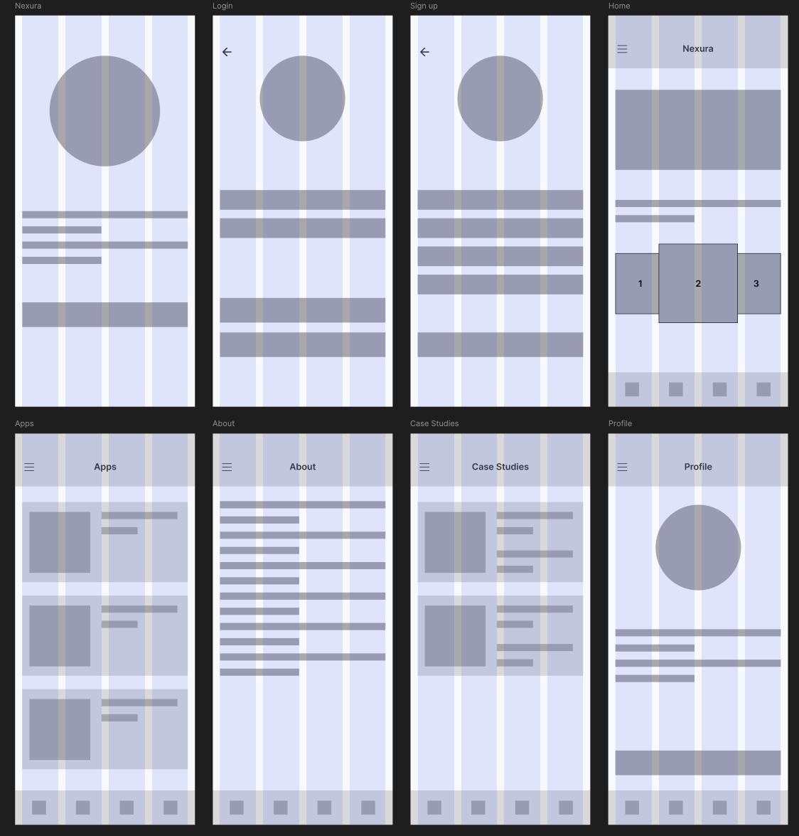
Removed placeholders and started adding in content that would be used in the final version
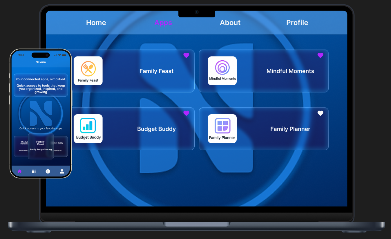
Final Design
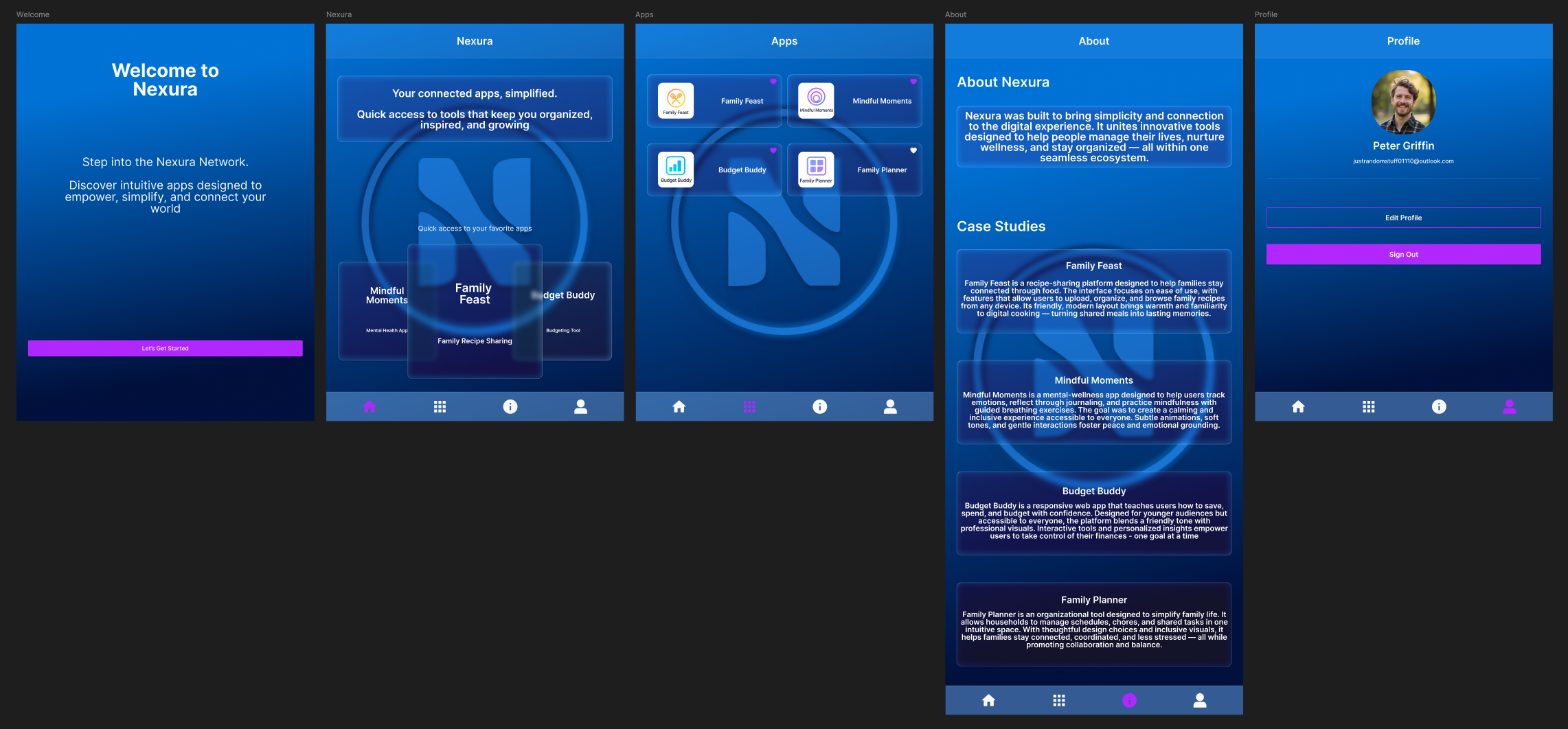
Expanded content to ensure that it fits on a tablet screen
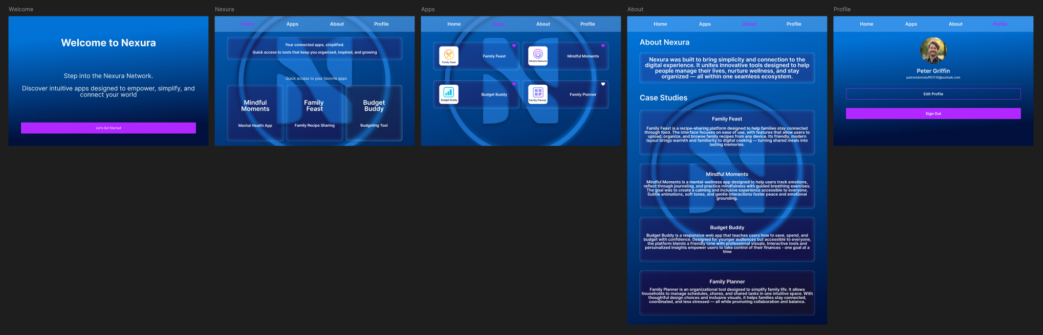
Adjusted spacing and sizes of content for desktop devices
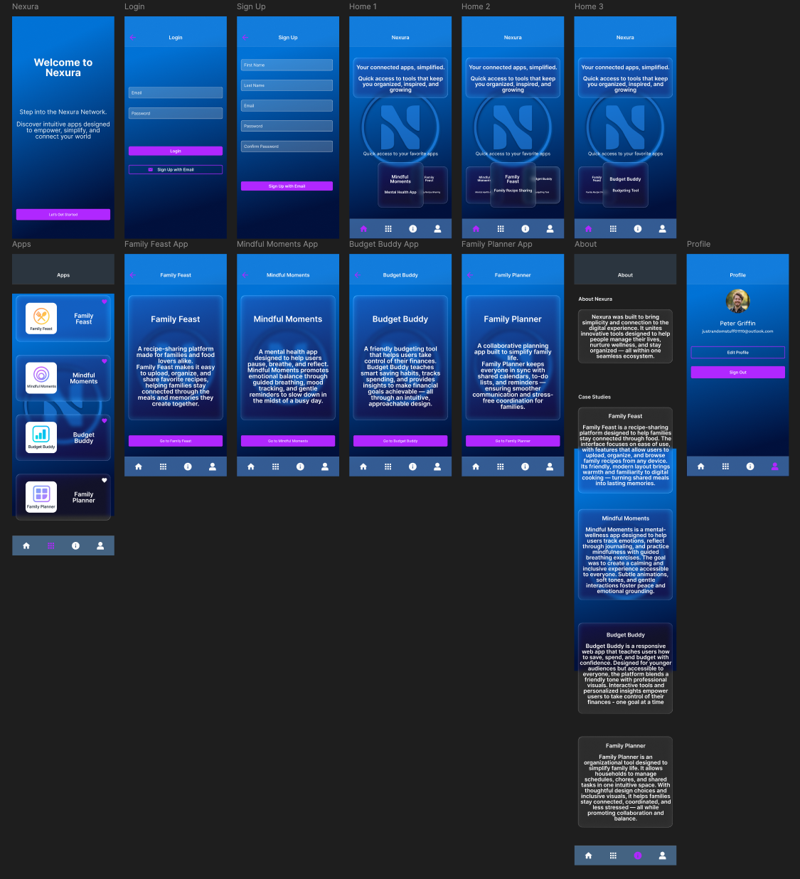
Key Features
Prototypes
High-Fidelity UI
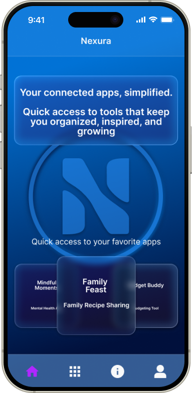
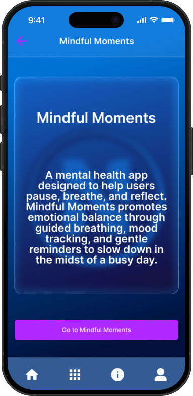
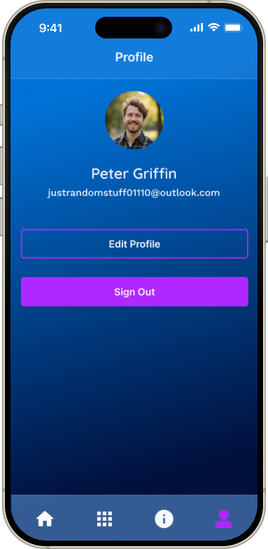
Mobile Prototype:
Ensure that all functionality is working and easy to navigate throughDesktop Prototype:
Ensured that everything flows smoothly from mobile to desktopAccessibility Considerations
Reflection
Designing Nexura taught me how to think systemically — creating a unified ecosystem rather than a single app. It strengthened my skills in accessibility, scalability, and visual harmony, helping me balance an advanced aesthetic with real-world usability.