Kaldrix
Providing simple solutions to customers
Overview
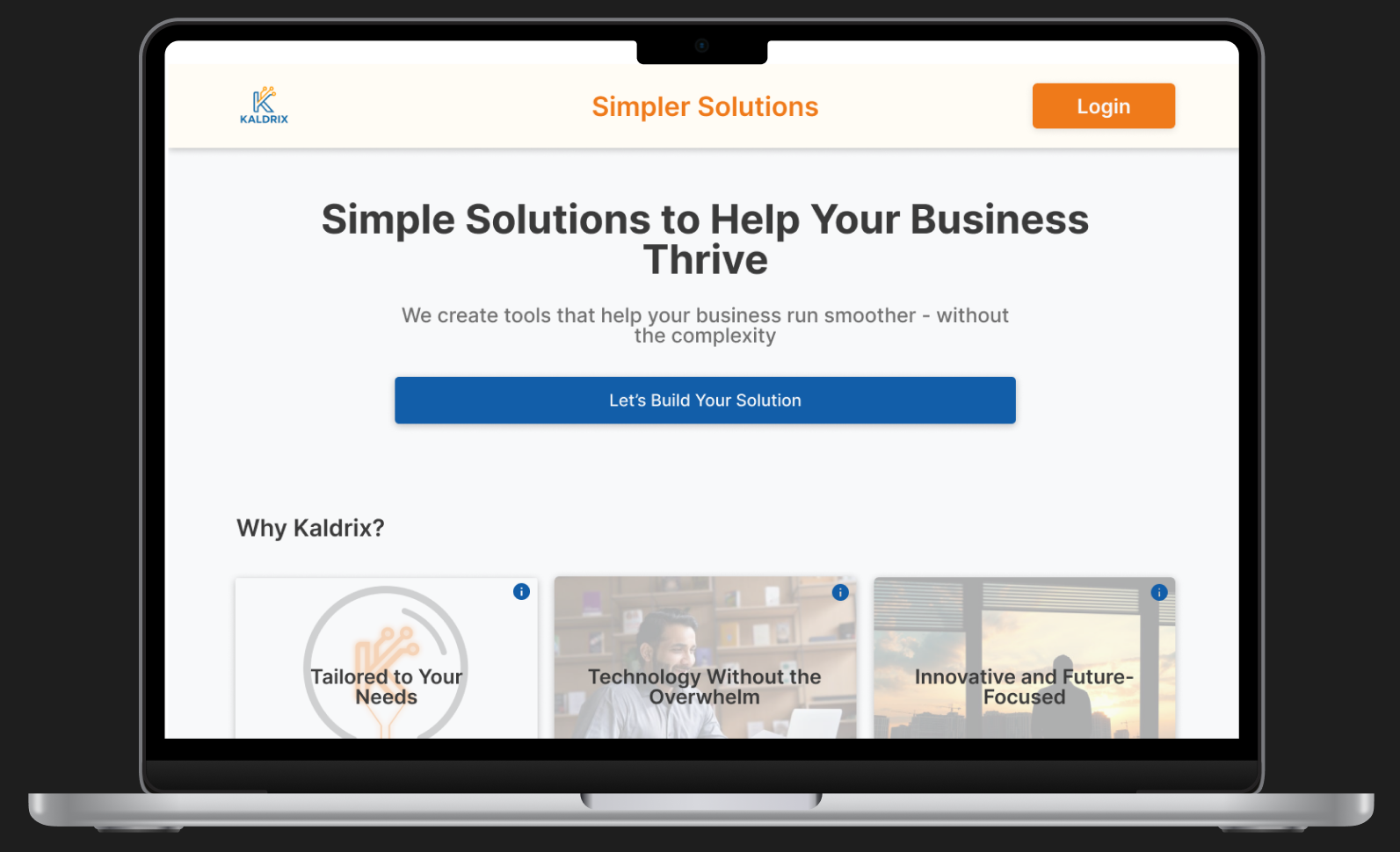
Kaldrix is a company focused on providing simple business solutions. I was asked to design a clean, responsive landing page that would reflect the brand’s values of clarity, innovation, and ease of use. The final designs included mobile, tablet, and desktop layouts, interactive feature cards, and a complete asset handoff for implementation.
Problem
Kaldrix needed a clear, modern online presence to introduce their brand and showcase their core product, ClearPath. Their existing page was minimal, and they didn’t yet have a centralized landing experience that felt cohesive or scalable. They wanted a design that would communicate their message without overwhelming users.
Goals
Design a responsive landing page for desktop, tablet, and mobile, maintain a clean, simple layout that aligns with the Kaldrix brand, include a section for ClearPath without overshadowing the main brand, highlight core values through strong visual structure and interactions, ensure the design is easy to implement in no-code platforms like Lovable
User Persona: Jordan
Jordan is a tech-savvy, efficiency-focused business owner looking for digital tools that are easy to use and not overloaded with unnecessary features.
- Discover simple, effective business tools online
- Quickly understand what a product offers
- Access company info clearly on mobile or desktop
- Overly complex websites with unclear navigation
- Pages that feel bloated or too salesy
- Poor mobile experience when browsing during work breaks
- Clean, quick access to value propositions
- Mobile-responsive design for flexibility
- Clear visuals that explain without overexplaining
- Goals:
- Frustrations:
- Need:
Design Process
Wireframes
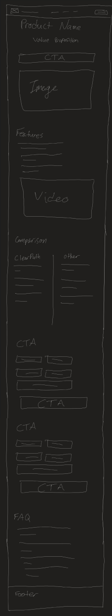
Rough sketches of what I envisioned the Kaldrix page to look like
Low Fidelity
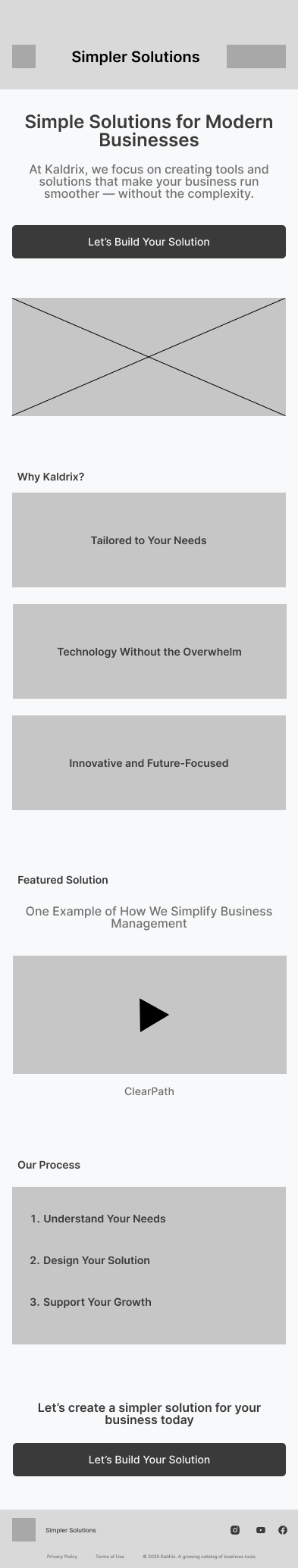
Removed placeholders and started adding in content that would be used in the final version
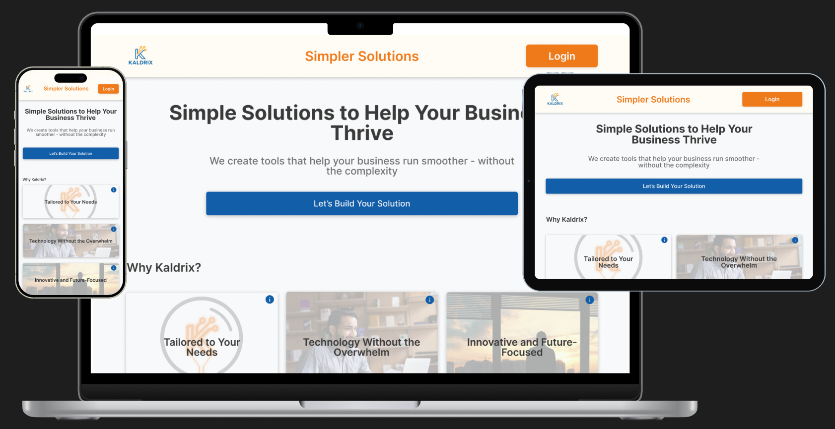
Final Design
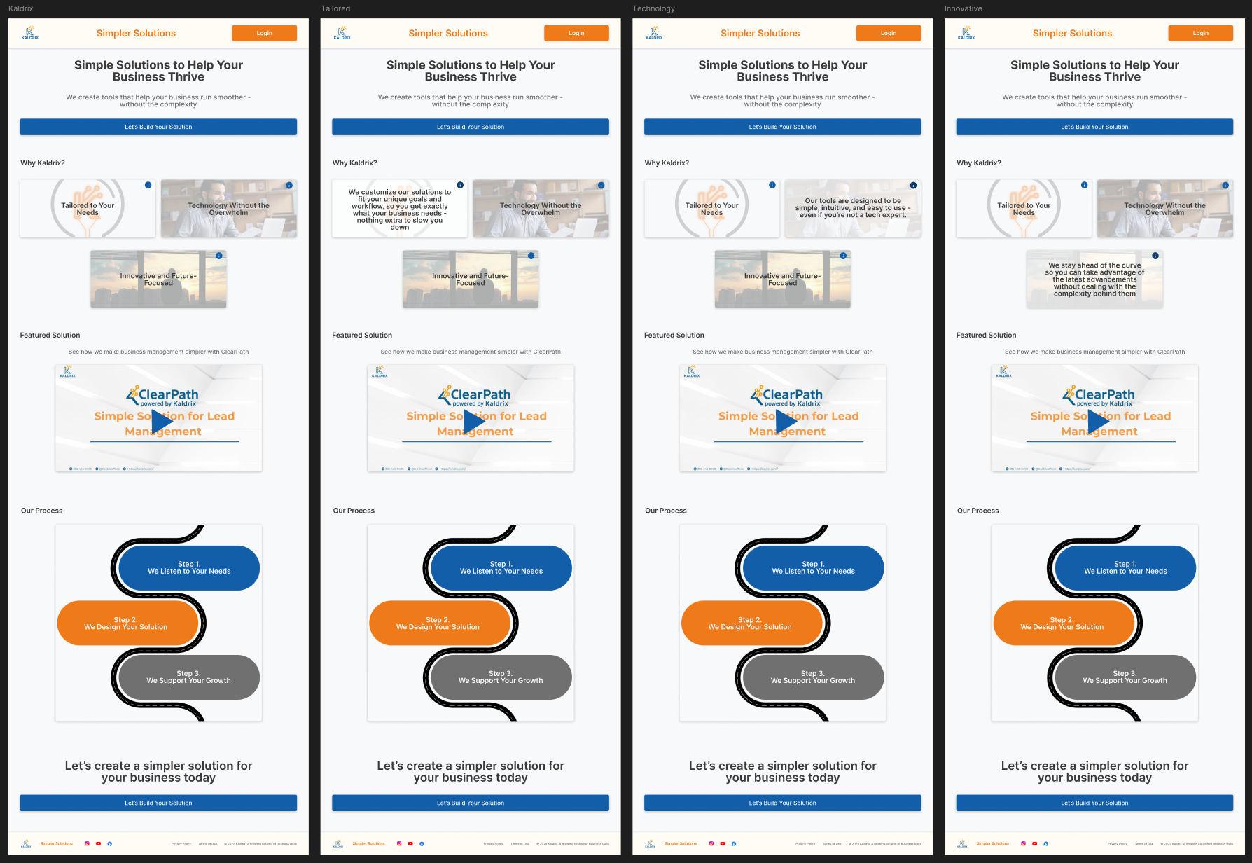
Expanded content to ensure that it fits on a tablet screen
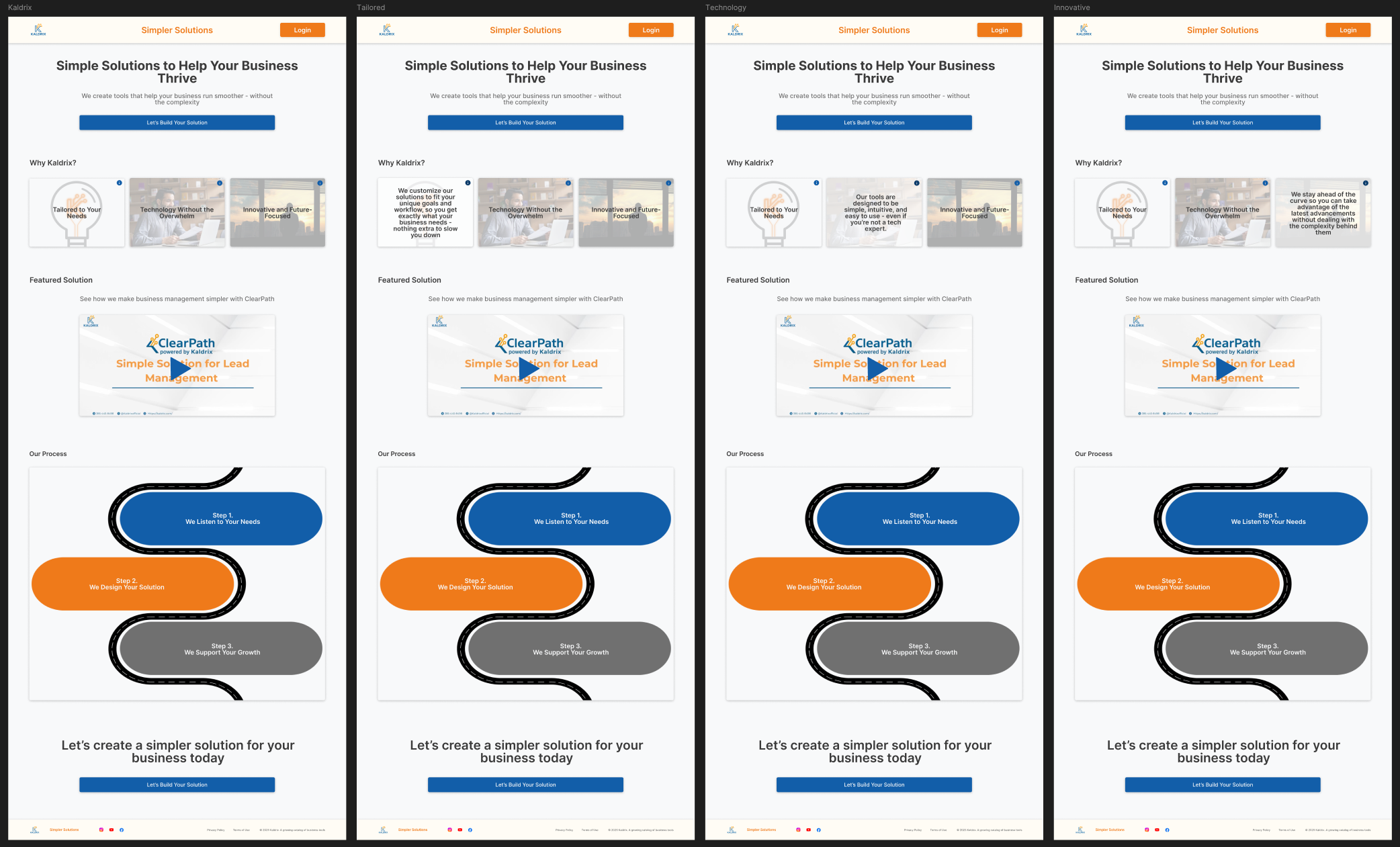
Adjusted spacing and sizes of content for desktop devices
Key Features
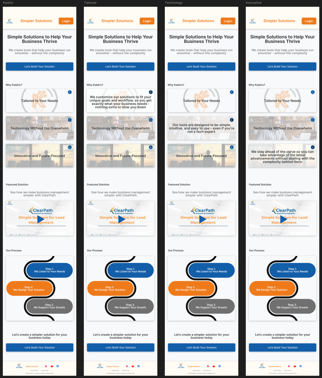
Prototypes
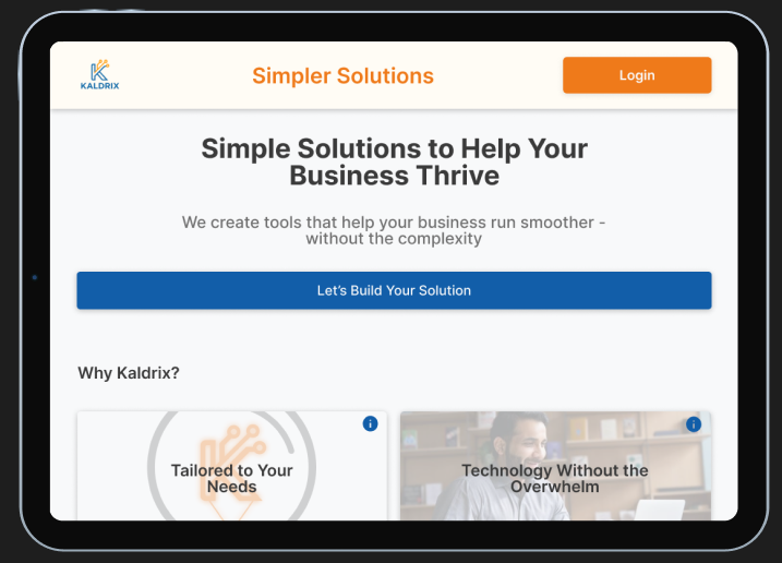
High-Fidelity UI
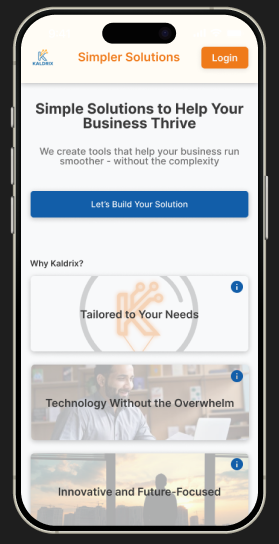
Mobile Prototype:
Ensure that all functionality is working and easy to navigate throughTablet Prototype:
Ensure that all functionality is working and flows smoothly from mobile to tabletDesktop Prototype:
Ensure that everything flows smoothly from mobile to desktopAccessibility Considerations
Reflection
This project gave me the opportunity to work closely with a real client, respond to live feedback, and design for implementation in a real-world tool (Lovable). While the final version of the site evolved slightly during buildout, the core layout, brand tone, and responsiveness remained intact. The development team even described the mockups as “beautiful,” which reinforced that my design approach was both effective and practical.